DU.edu: Information Architecture Case Study
How I led information architecture for the University of Denver’s website redesign at A Hundred Years Agency, using card sorting and information design theory to turn a ten-year-old sitemap into a navigation that helped lift applications by 18%.
The short version
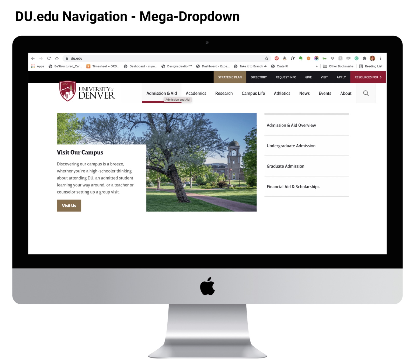
The University of Denver had not updated its website in seven years, and its information architecture was more than ten years old. Working for A Hundred Years Agency, I led the IA across 12 weeks of discovery and design: we introduced information design theory to stakeholders, card sorted the existing site with about 53 people from marketing and admissions, and turned the results into a sitemap and navigation for desktop and mobile.
- +18%increase in applications after launch
- 6 sprints12 weeks of discovery and design
- 2018launch, and still in use on du.edu today
Beyond applications, the new navigation brought better accessibility scores and SEO gains. The project moved at the pace of an institution, so the path looked different from what we planned, but the architecture held.
Problem
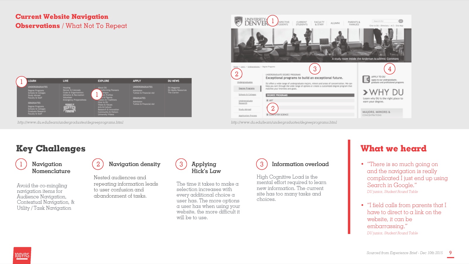
A website that had outgrown its structure
Information is essential to any organization, and universities hold their sitemaps and page titles tightly. When we joined, DU.edu had not been updated in seven years, and its information architecture had not been revised in more than ten.
“The website is like a space, like a building. It represents the University to the outside world... our website needs to be the virtual space, the place, the information source, the image, the representation of everything wonderful that the University is, just like our physical campus does.”DU Steering Committee member
Outcome
A navigation that is still in use
Our hypothesis was simple: by running a card sorting exercise, we believed the new information architecture would be truly informed by, and useful to, the people who use it.
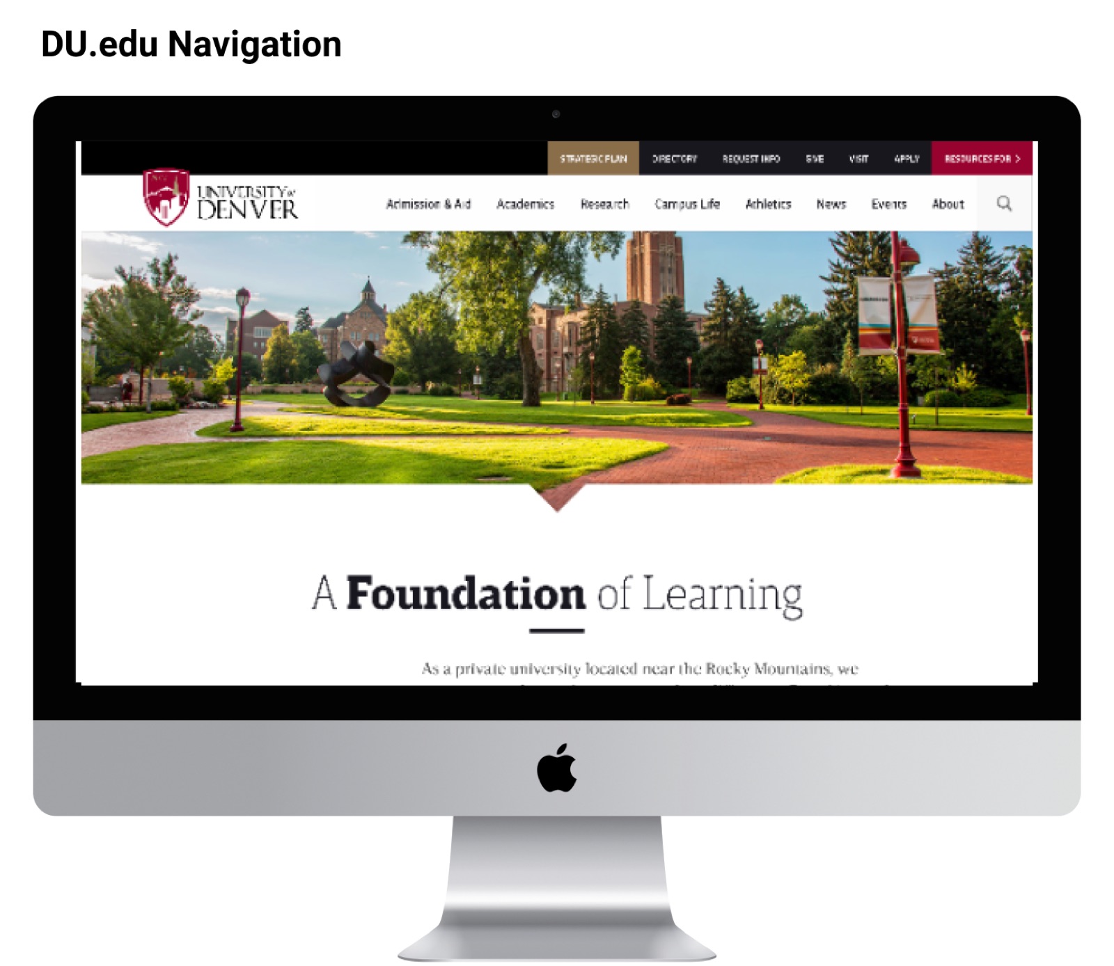
Success meant a sitemap the university could lock in and use to restructure its content, and a navigation, for desktop and mobile, that was easy to find your way around. The new navigation structure became part of the final execution. It launched in 2018, and it is still in use at du.edu. Applications rose by 18%, and accessibility scores and SEO improved.
Scope
What was in, what was out
The work was the information architecture and the navigation that expressed it. Visual design, content and development ran alongside it with the rest of the team.
In scope
- Competitive analysis of peer university sites
- Information design theory for stakeholders
- Card sorting and analysis with Optimal Sort
- Sitemap and navigation strategy
- Desktop and mobile navigation UI design
Out of scope
- SEO overhaul
- Content migration
- Validation user testing
Stakeholders
Balancing a lot of voices
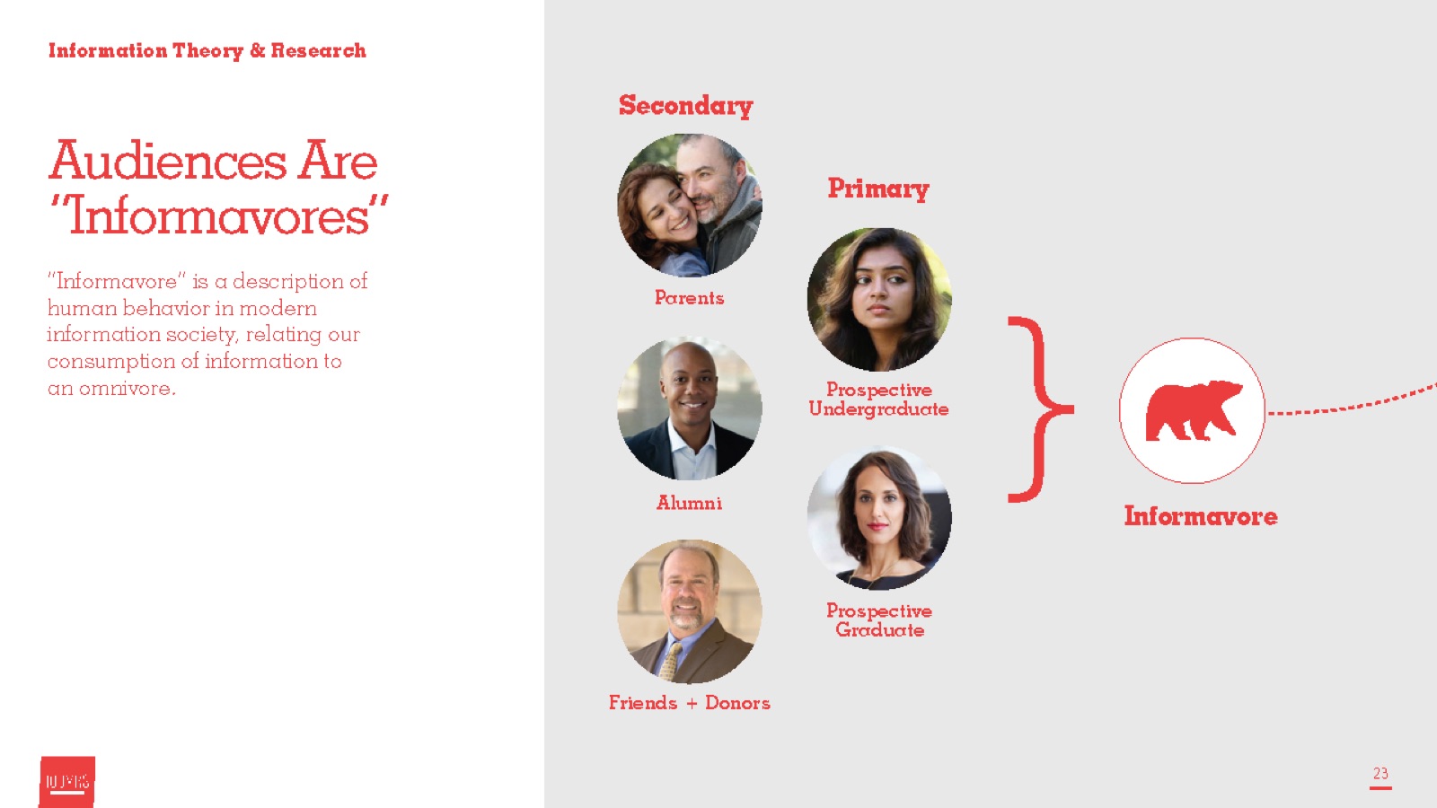
Working with university administrators, faculty representatives and the marketing department made this a tricky balancing act. The good news is that institutions of higher learning don’t shy away from the chance to learn, so we brought information design theory into the room to bring our clients up to speed and to explain the IA decisions.
- Steering committee and administratorsThe decision makers who owned what the site said about the university.
- Marketing and communicationsThe team that guarded the brand, the sitemap and the page titles.
- Marketing and admissions teamsAbout 18 people from marketing and 35 from admissions took part in the card sorting and shaped the groupings.
- Faculty representatives and studentsParticipants in the card sorting, and the people the site serves every day.
- The project teamOne project manager, one creative director, two senior designers, two developers, and me as the senior UX/IA designer.
Timeline
12 weeks, 6 sprints, from theory to navigation
Discovery and design ran 12 weeks across six sprints, as part of a redesign that launched in 2018. We moved from what DU had, to what peers did, to what users told us, to a structure.
- S1
- S2
- S3
- S4
- S5
- S6
- Challenge and competitive analysisReviewing what peer universities were doing, to bring DU.edu into the modern web.
- IA theoryTeaching information foraging and information scent, so decisions had a shared language.
- Analysis and card sortingAn Optimal Sort of the current IA with about 53 people from marketing and admissions, plus faculty and a small set of students.
- New IA and sitemapTurning the groupings into a sitemap, then locking it.
- Navigation UIDesigning the desktop and mobile navigation from the sitemap.
Competitive analysis
To bring DU.edu into the modern web, we first looked at what the university space was doing.
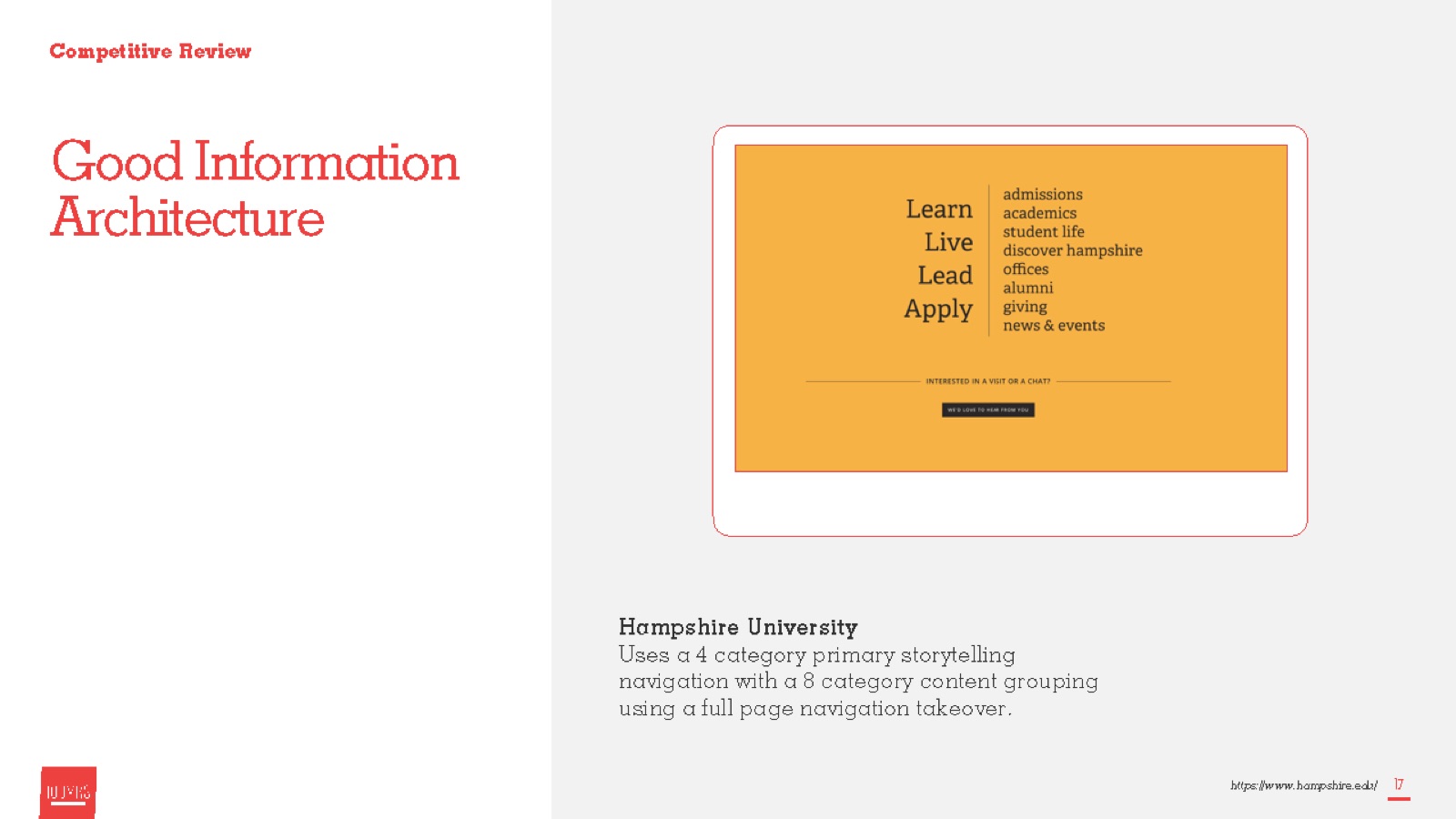
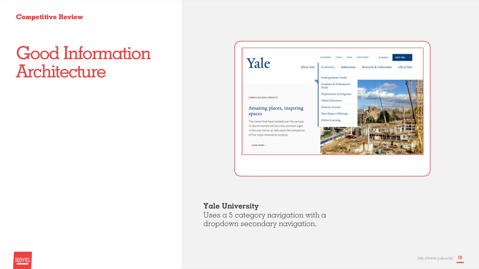
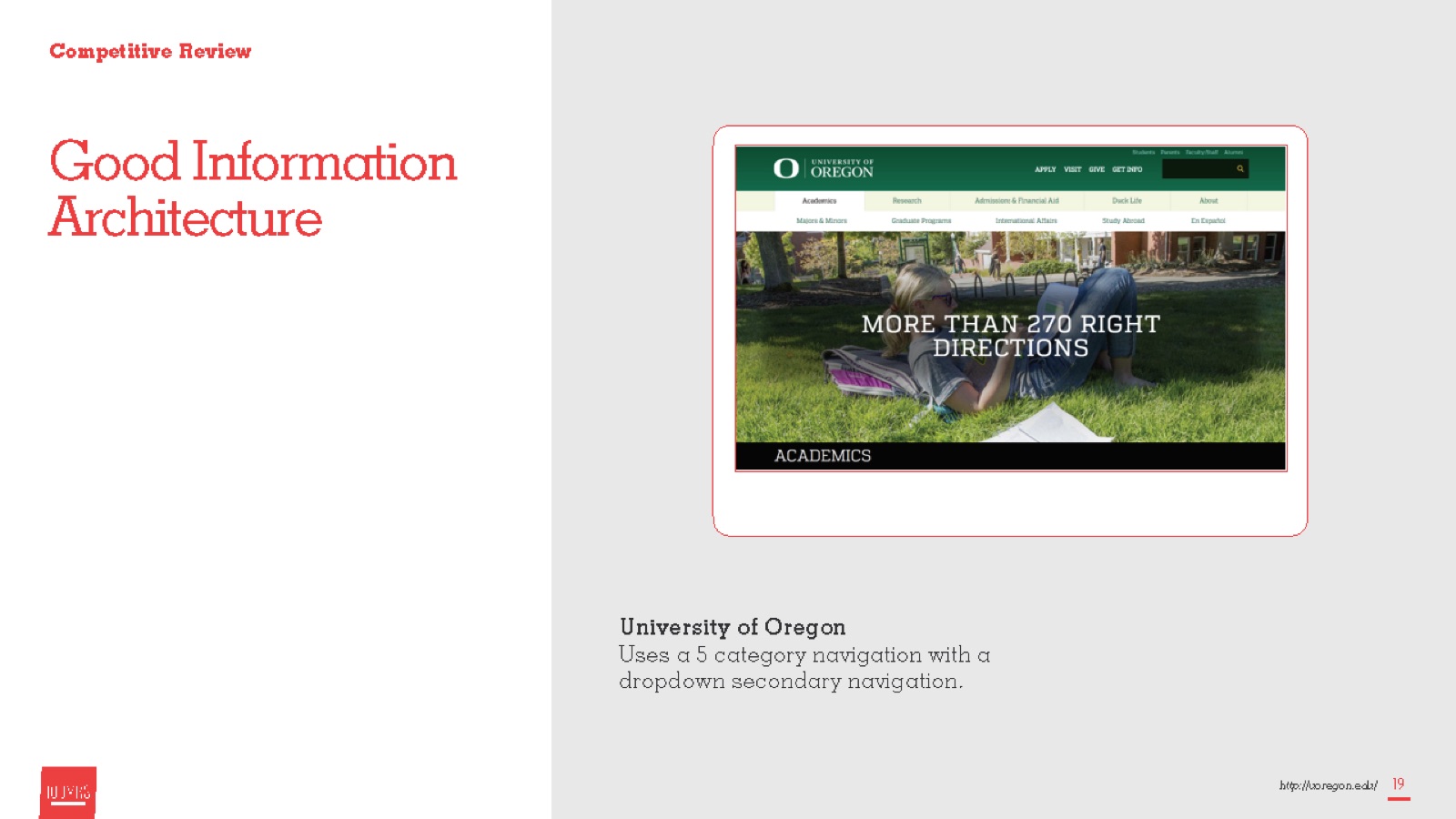
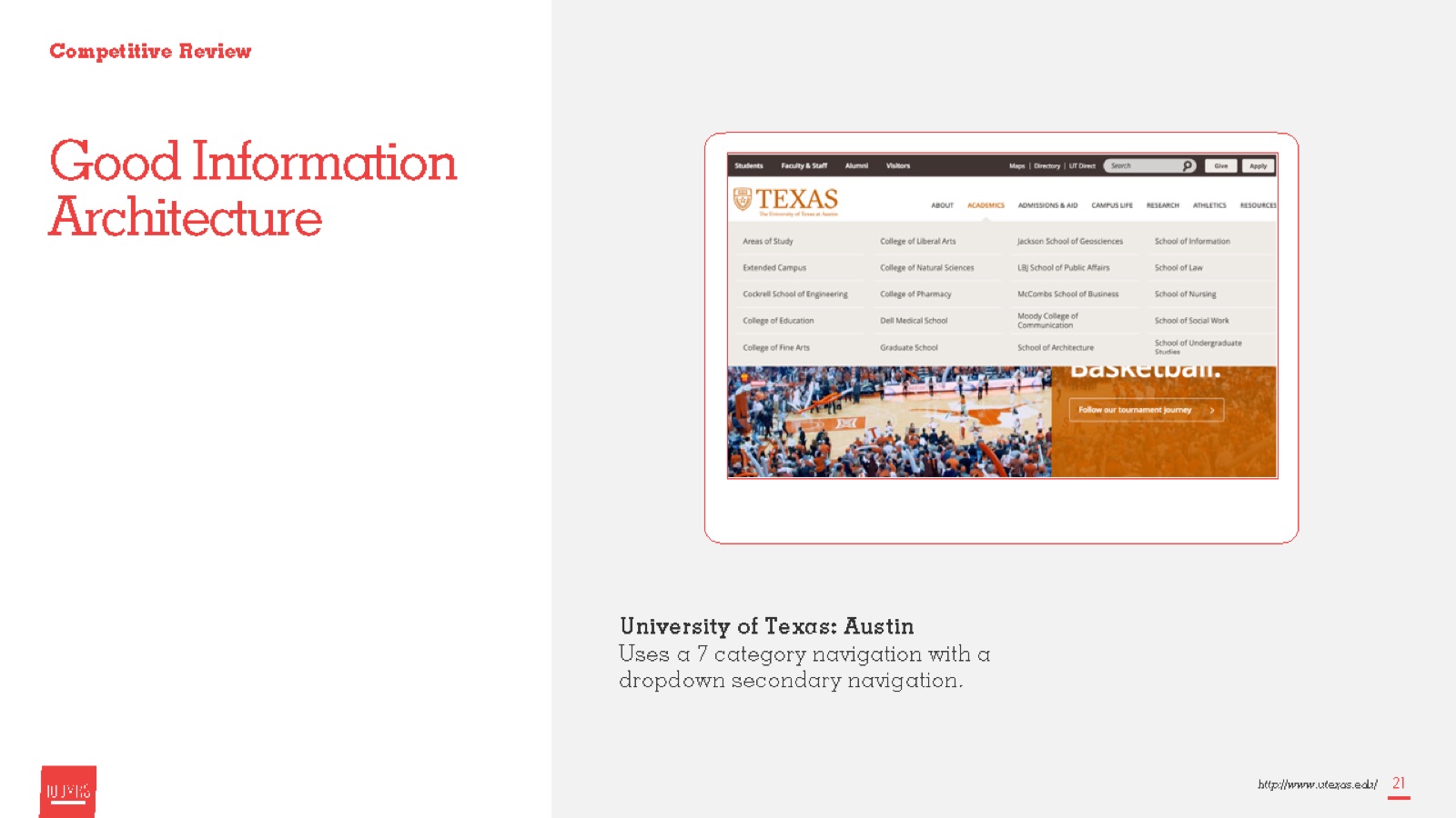
Information architecture theory
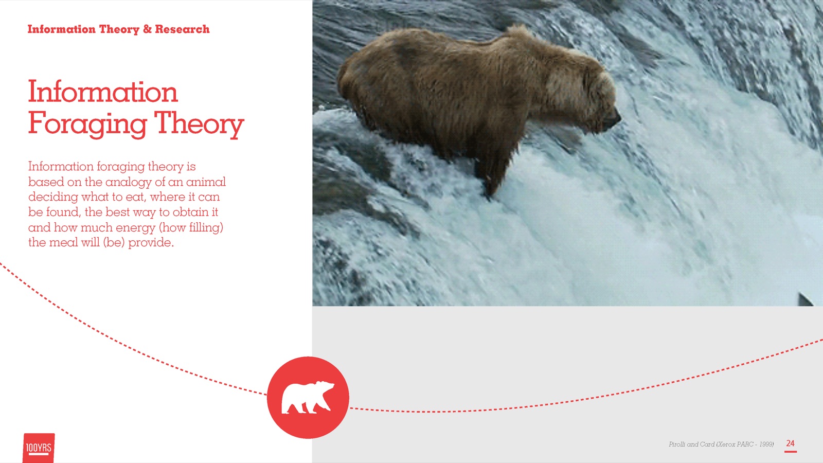
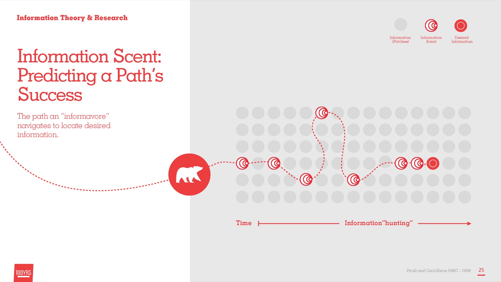
We introduced information design theory to stakeholders so we could justify IA decisions. The ideas behind it are information foraging and information scent.
Four information scent best practices guided the work:
- Be explicit. Labels should describe what users will find at their destination.
- Show where you are. Give feedback about the current location.
- Skip the jargon. Don’t use made-up words, institutional jargon or your own slogans as navigation items.
- Use plain language. It helps SEO, usability and accessibility.
Artifacts
What we made
Card sorting and analysis
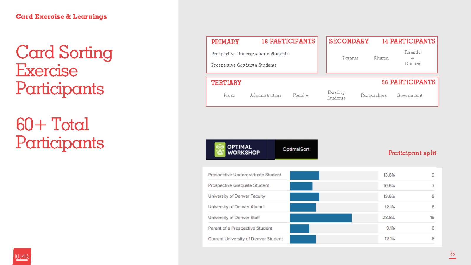
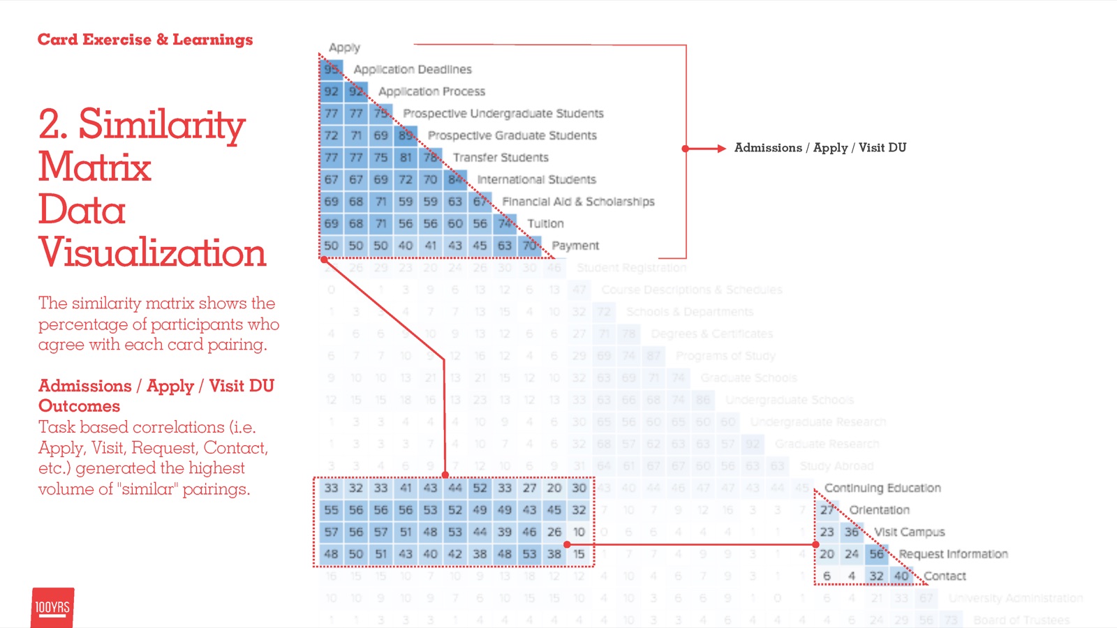
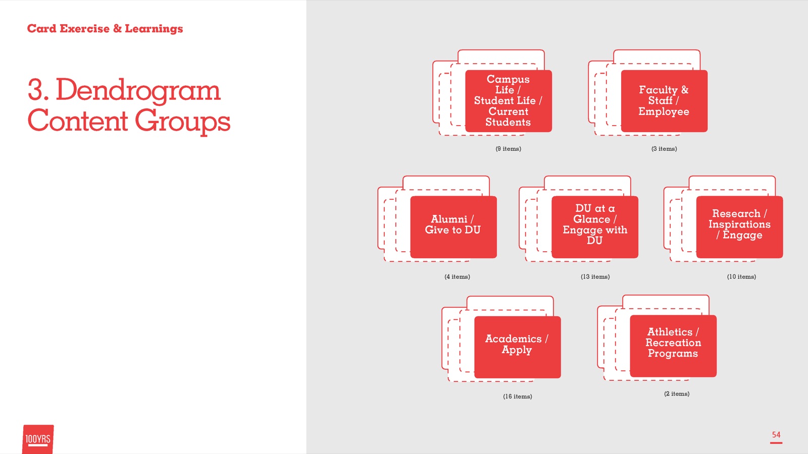
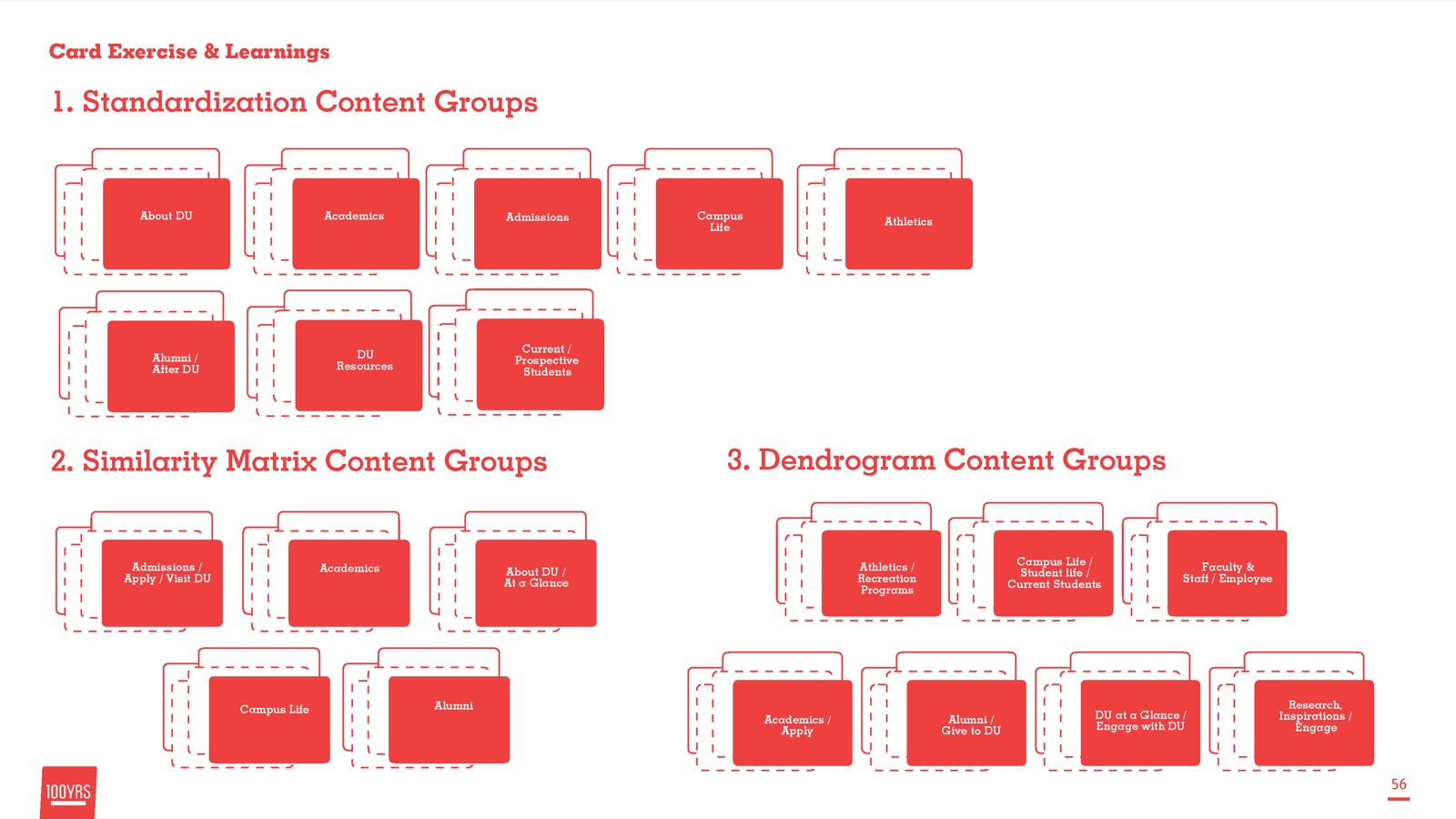
Working with about 18 people from marketing and 35 from admissions, plus faculty representatives and a small set of students, we used Optimal Sort to card sort the current IA, then tested it and formulated a new path forward. We analyzed the results with a similarity matrix and dendrogram visualizations to show how the groups formed.
Sitemap and navigation strategy
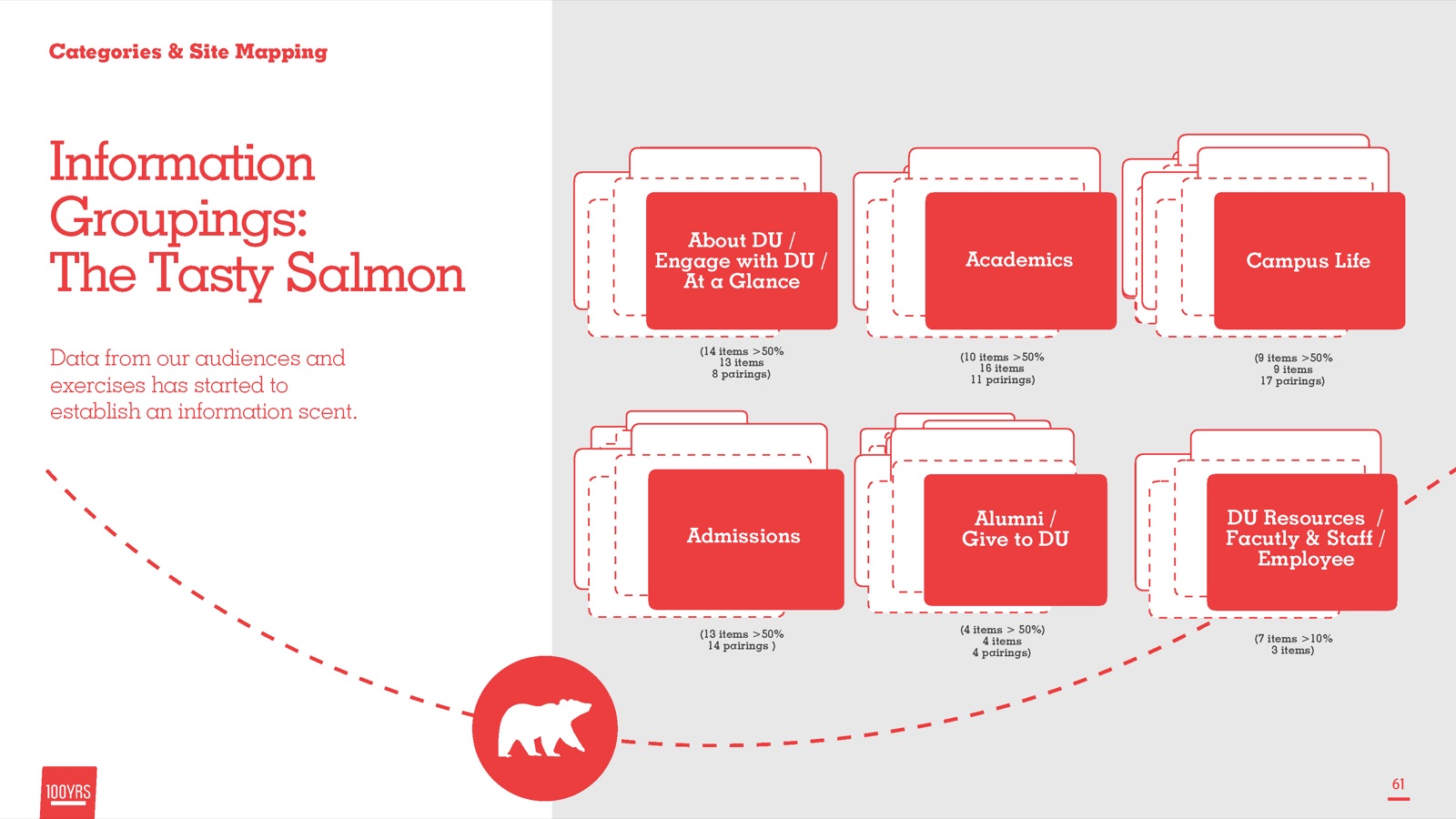
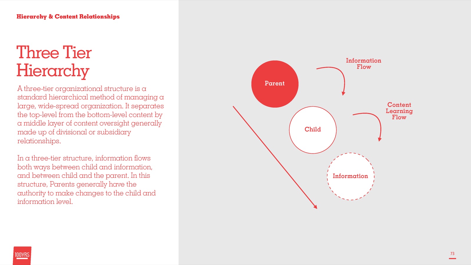
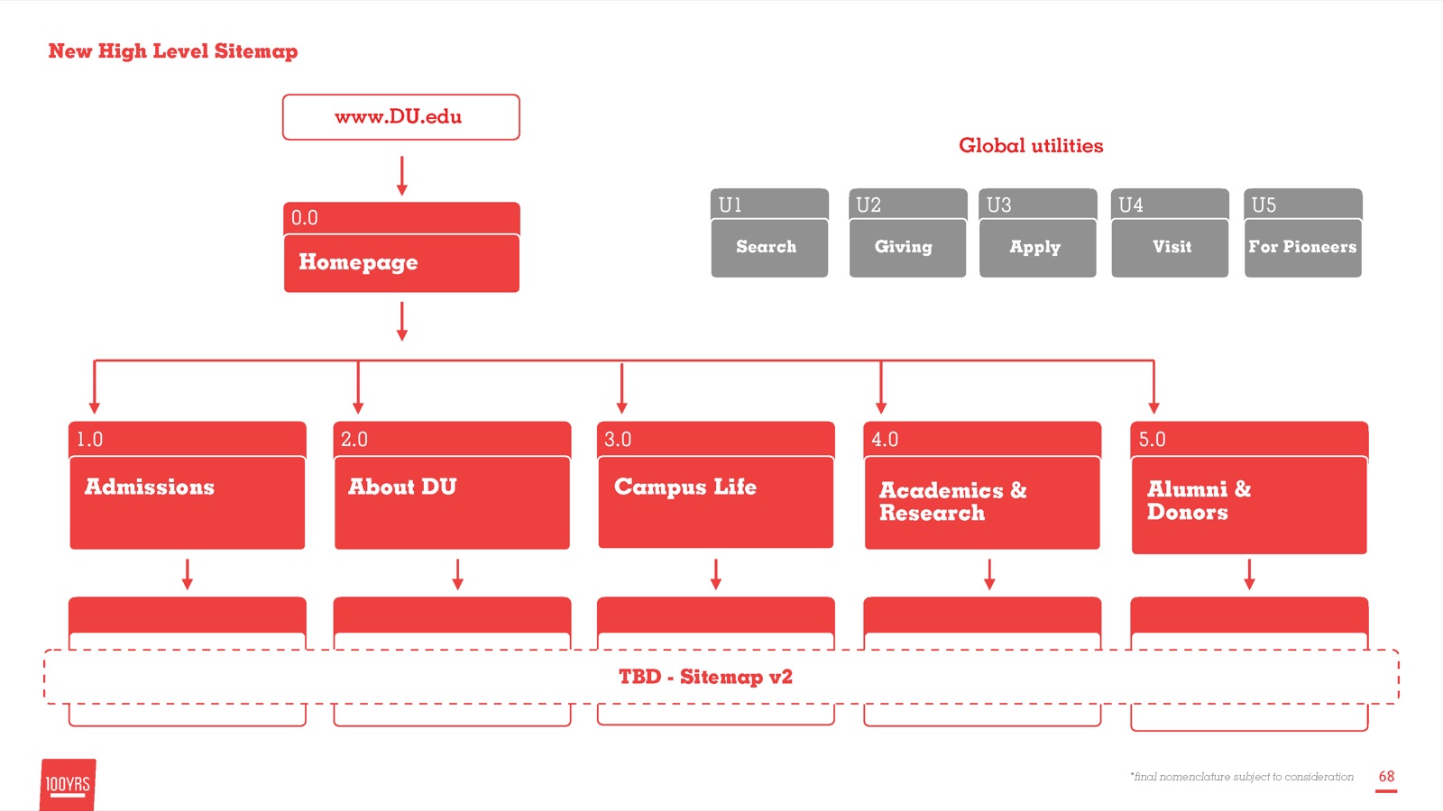
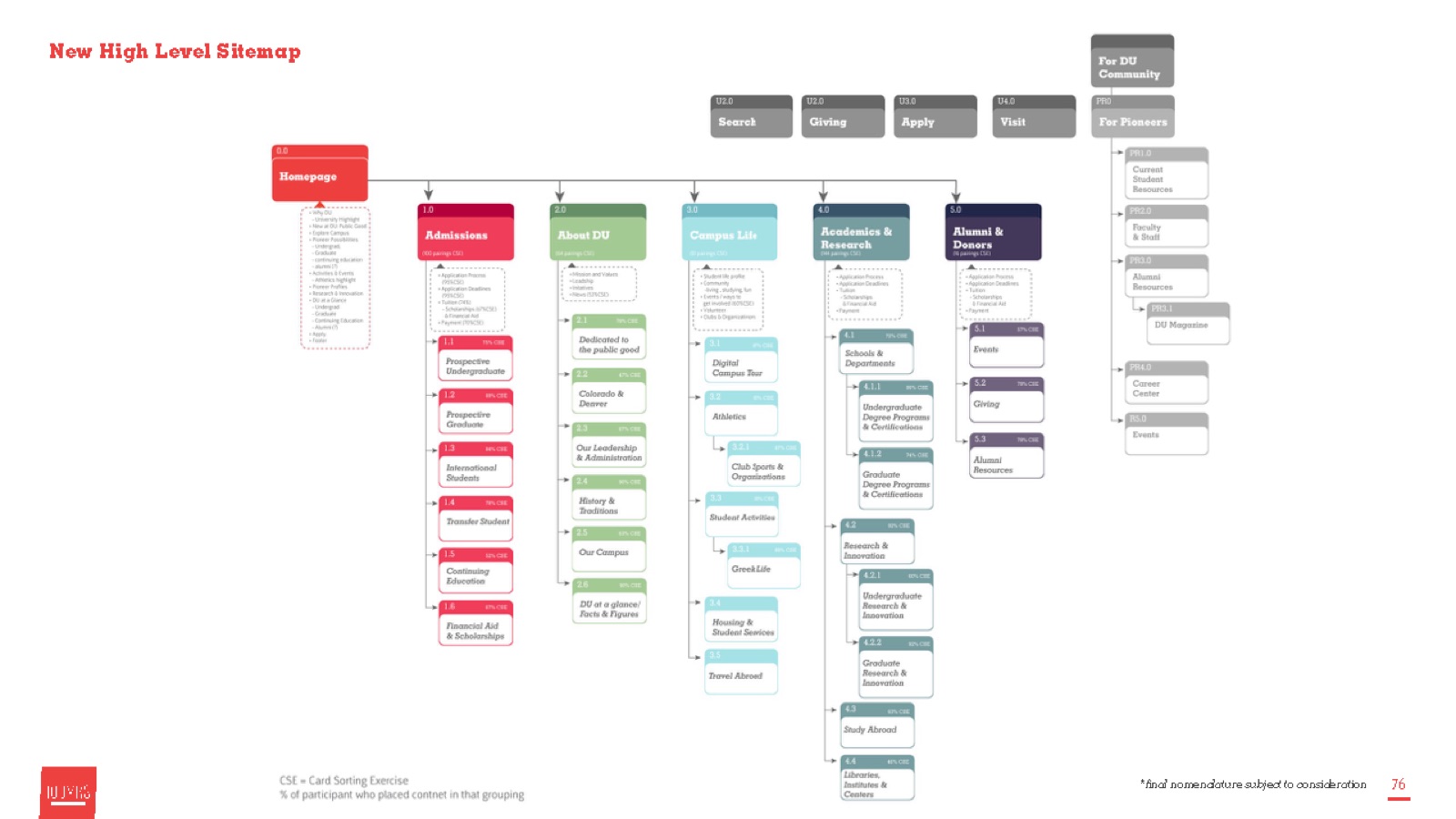
An IA is not a sitemap, but it leads to one and, ultimately, a user interface. We grouped the card sorting results, tested them against hierarchy models, and drew a sitemap.
Final navigation UI
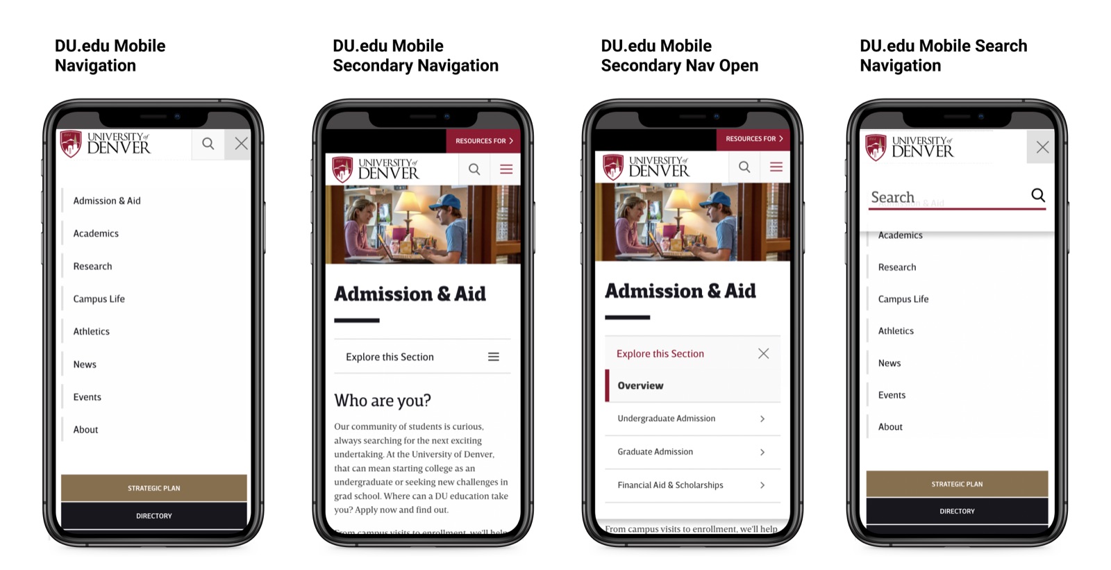
The sitemap became navigation for both desktop and mobile, designed as a mobile-first, responsive system.
Lessons Learned
What worked, and what I took from it
The team recognized early that the organization could only move so fast on decisions. That led to very different outcomes than we first expected.
What I took from it
IA and navigation are never finished. They are improved over time. A website is a living entity, and our solution gave DU room to add new ideas while keeping a solid foundation for users.
Navigation is negotiated. It has to be flexible enough to serve both users’ needs and the institution’s needs.
Let data inform the IA, not dominate it. Card sorting gave us a starting point, and judgment shaped the rest.
Information architecture is not a luxury for big projects. DU discussed and weighed the navigation updates for longer than expected because changing it had such deep implications for the institution. Usability, user-centered language and clear logic were what we wanted to infuse into the solution, and working with large groups of stakeholders means being willing to push and pull ideas.
What I’d do differently. I would have tested the navigation update earlier, with working prototypes. I would also have let the university team co-create more, since they took longer to come around to owning the changes.
Where it landed
We worked very hard to reach a final solution, and it is not etched in stone. That was the point.
The new navigation structure launched in 2018 and is still in use on du.edu. It brought an 18% increase in applications, better accessibility scores and SEO gains, and it gave the University of Denver enough room to keep improving it.